Real Madrid home jersey 2012-13 review
By Julian Smith, Lisbon, Portugal.
What a year Madrid have had… Los Blancos were finally able to snatch the La Liga title from the recent dominance of Barcelona claiming the honor for the 32nd time, amassing an incredible 100 points and 121 goals (+89 GD). Superstar Cristiano Ronaldo had arguably his best year in Madrid, scoring 46 goals in La Liga and a blistering 60 goals in all competitions. While they crashed out of the Champions League on penalties, Fiorentino Perez, Mourinho, and co must be happy with their overall performance. Having completed a season in such style, it’s no surprise that their 2012-13 home kit is just as classy.
The Shirt
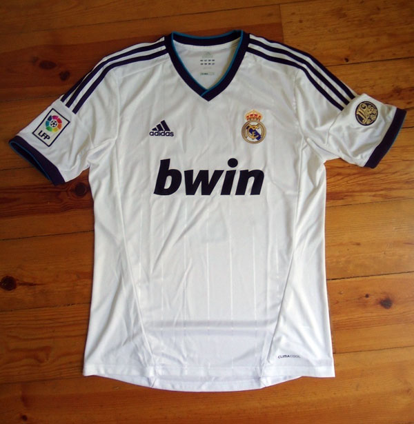
The 2012-13 Real Madrid home kit returns to the clubs royal roots with a nice combination of dark purple with turquoise lining. The new style may seem a bit odd at first glance, but it definitely grows on you and looks fantastic when worn. As always, the kit is mostly white and sports the triple stripe (the Adidas trademark) along the shoulders and down the arm.
The material is nice and soft and feels fantastic to the touch (unlike Nike’s shirts before Euro 2012). Still the standard 100% polyester seen in most replica shirts these days, it is comparable to other Adidas shirts worn in recent years.
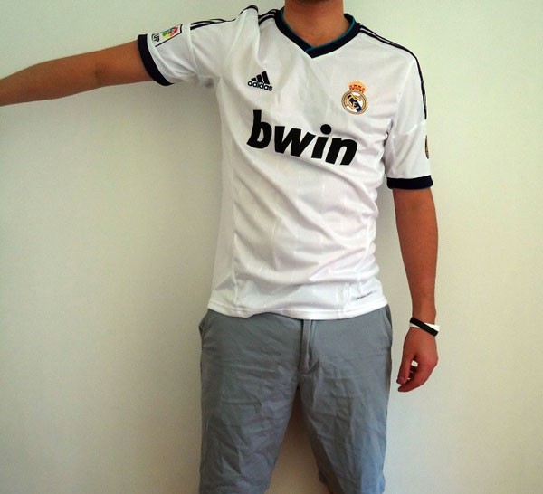
*Note: Shirt being worn is a medium, wearer is 6’1” and 160 pounds (1.85m, 72.5 kg)
The neck and armholes are reinforced with a double lining of the same material and weigh the shirt down a bit to reinforce the structure of the shirt on the body. An important point to mention is this double lining actually gives the arms a more fitted wear, so if you extend your arm outward the sleeve will stay up, as seen in the above pictures.
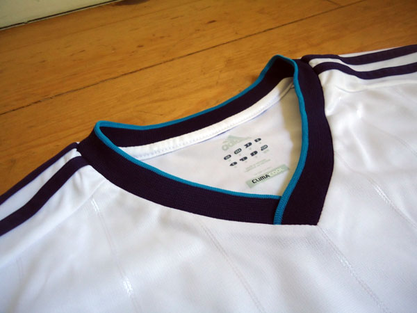
Adidas opted for the flat collar as opposed to last year’s protruding collar. The divergence allows for the cool royal accenting, and now you don’t have to worry about making sure the normally flimsy protruding collar is always in place when you’re wearing it.
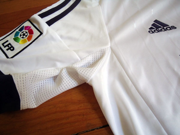
The Clima Cool technology this year is incorporated in the vents placed under both arm pits.
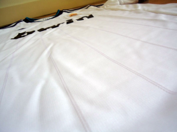
An interesting detail to note that is not so visible in pictures is the silver pinstripes running along the front of the shirt. The accent adds an extra bit of flair and, again, helps give the shirt a better structural look when worn.
Details
The replica shirt features the standard embroidered La Liga logo on the right arm and the plastic “bwin” logo used since the 2007-08 seasons. Real Madrid and Adidas have made to huge improvements this year, though, which I would like to highlight.

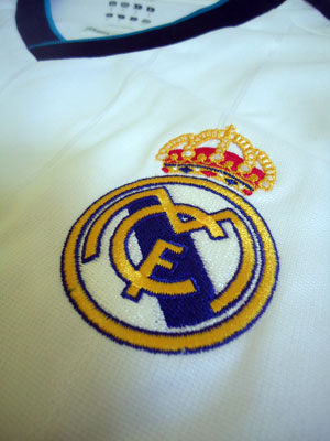
Old Crest New Crest
A very disappointing aspect of last year’s shirt was the club crest. While the shirt itself looks great the plastic, almost fake, looking badge is kind of a bummer. This year, the badge is embroidered and stitched into the fabric, giving the shirt a much better and authentic look.
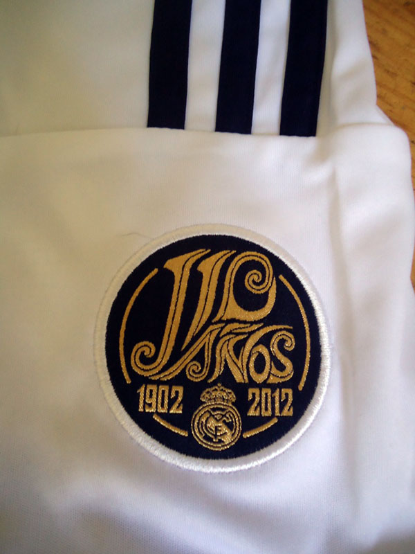
An addition to this year’s shirt is the “110 anos” (110 years) badge on the left arm. This neat detail commemorates the clubs 110th year as an official club since its original founding in 1902 as Madrid Football Club. Fun fact: the club only became Real Madrid (which translates to Royal Madrid) in 1920 when King Alfonso XIII dubbed them so and placed the crown on top of the club crest.
Printing
The official Real Madrid printing for the season 12/13.
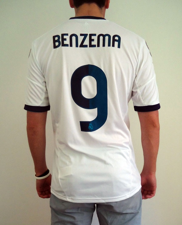
This year’s print style is probably one of my least favorite aspects of Madrid’s 2012-13 shirt. The two-tone number, in my opinion, doesn’t really fit so well with the rest of the shirts color palate, and the combination of the edged and curvy lines looks a bit awkward.
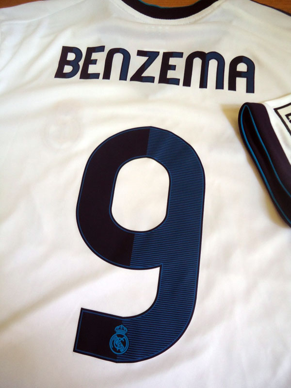
As seen in the above picture, the printing accent color and the shirt accent color are not the same. Perhaps if Adidas and Madrid had brightened the print accent color and not made it so prominent it would have looked better…
Conclusion
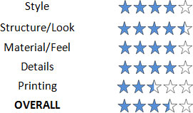
All in all, the shirt looks and feels great. Personalizing takes a bit away from the shirts stylishness, but that certainly won’t deter a true fan.
