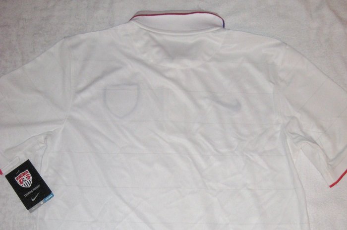
14/16 USA home jersey, by James Um , DC
A far departure from the polarizing red and white hooped home shirt, Nike and the USA Soccer Federation chose a more traditional, albeit brutally bland, design for the 2014 World Cup. Don’t let the appearance fool you though, as Nike has quietly revamped their jerseys, introducing new technologies which hold up well on the pitch.

To the touch, Nike has this time opted to go with a more thin cotton-esque feel compared to their earlier predecessors and when it comes down to the on field performance, the new style wins hands down. It’s moisture wicking fabric holds up very well, even after hours of playing in it and never did I ever feel any sort of discomfort.

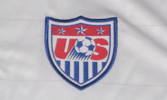
To the aesthetics now, this shirt features an embroidered Nike Swoosh and team crest. There is a newly designed “Authentic” tag on the bottom right and your familiar “Dri-Fit” woven into the bottom left. On the inner neck, you can find the 13 stars which represents the original 13 North American British Colonies. Along with that is a collar with a button up, which gives it a business casual look with light gray horizontal line patterns a la the 2008 USA shirt. With no name or number, one can pull this off as a polo. With a majority of the World Cup games falling on a workday in America, it’s almost as if the designers had the working class in mind when producing this.

Detail look at the inside of the collar:

Come June, the USA are set to face Germany, Portugal, and Ghana, in what can be argued as being this tournament’s group of death. With a challenging task ahead, the USA can find some solace in the fact that their shirts are at least comfortable and at this point, they’ll take all the help that they can get.

Made in:

