Real Madrid 2013-14 Home Long Sleeve Shirt Review
by Julian Smith, NYC

FINALLY! 12 loooong years in the making, and billions in money spent (probably no matter what currency you’re thinking of) and Madrid have won their tenth Champions League! There was a feeling in recent years that it was getting closer, but it seems that the club unlocked the secret during the 2013-14 season. Seasoned veteran (and proven winner) Carlo Ancelotti certainly had something to do with it, as did world record signing Gareth Bale after his initial growing pains, but the stellar player of the greatest player in the world two years running (yeah, I said it), Cristiano Ronaldo, really was the glue to bring everything together and achieve this glorious title.
The only thing that could dampen the parade of such an accomplishment would be a poor shirt that would have to be viewed for eternity in the replays of the season… and while all three of Real Madrid’s shirts this year were not anything stellar, their home shirt unfortunately falls a bit off the mark.
The Shirt

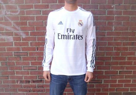
Real Madrid’s 2013-14 home shirt stays true to the clubs nickname, “Los Blancos”, with the color white dominating 99% of the shirt (not including sponsors, badges, and printing). The collar is a common circle opening, with a slightly more rigid border around the neck hole.

The material is quite nice, soft and comfortable, but the structure of the shirt does not feel quite right. When worn, it feels almost boxy and does not lie well on the body (see cover picture). I have noticed this could be only a factor for the long sleeve shirt… so please take note of that.
Details

One of the most noticeable attributes of the shirt is the horizontal stripes running across the body. This is by far my least favorite part of the shirt, and takes away from the discreet elegance that has donned Real Madrid’s home kits for centuries. This may also be the culprit for at least the box-y look of the shirt I referred to earlier.

The club badge is sown into the shirt, unlike the plastic print badge that was applied in years past (and what seems to be used for the upcoming 2014-15 shirts).
The trim on the shirt is an electric orange color; the Adidas logo and triple stripes going down the arm are in metallic silver.

The under arms have ventilation running all the way from the shoulder, to the pit, down the sleeves.

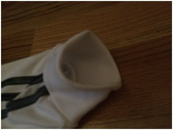
I love long sleeve adidas shirts for the cuffs on the sleeve openings. They have used this design for a few years now and it looks and feels great, not only the material but also when worn. The material doubles over to create the cuff to create the look and feel.
Printing

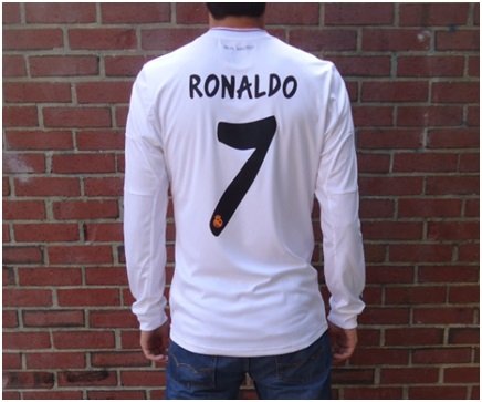
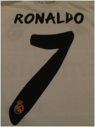
I have been disappointed with Real Madrid’s printing in recent years, but this year seems to be a bit of the inverse (I usually like the shirt, and not the print).

While the font is a bit overdone and slightly bolder than I would like, it is better than in years past and adds a bit of Spanish flair. I would prefer that they opted for a more modest design that would fit the plain and graceful shirts of years past.
Conclusion

Certainly one of the worst reviews I have ever done, but that isn’t to say this is a poorly made shirt. As a collector, I appreciate the effort to manifest a club’s culture and heritage through their shirt, and I just think Adidas got it wrong this year. Still, it is an integral piece of Real Madrid’s history, and should be part of any true Madridistas collection!
As always, the official kit and printing are available to purchase from MMSports.
