Latest News! A new Premier League design has been launched with regard to letters and numbers.
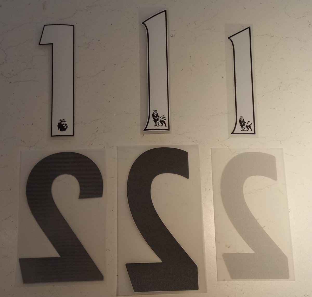
New sleeve badges were introduced before the start of the season 2016/17. The new design seen to the left of the photos were introduced as substitutes for the previous design seen to the right hand side of the photo.
Apparently the Premier League is now such a massive business in its own right that they do not need an external sponsor anymore. The league advertises the league: Premier League.

The new logo featuring a lion head with a crown on top has been included in the numbers as well starting with the 17/18 season.
The font of the numbers has also changed to a more clean less bulky one.

In the photo to the left hand side the new font is seen. At the center the old player’s version PS PRO. And to the right hand side of the photo the old replica version called PU.
The new 17/18 product has essentially merged the two by bringing the quality of the PS PRO with color block at the back while downsizing the size to the size of the old PU format.
The logo size seems about the same taking into consideration the dimensions of the new and old version.
Letters have also changed to a new font.
From the top the 17/18 letters. PS PRO letters, PU letters.
Once again the two types of letters from previous seasons have been merged into just one.
The size of the PU with the quality of the PS PRO.

and finally let’s take a look at how the new sleeve badges look like in real life applied on a jersey. The Puma above the lion. Pretty good fit for the Arsenal youth kit: size wise and design wise.

