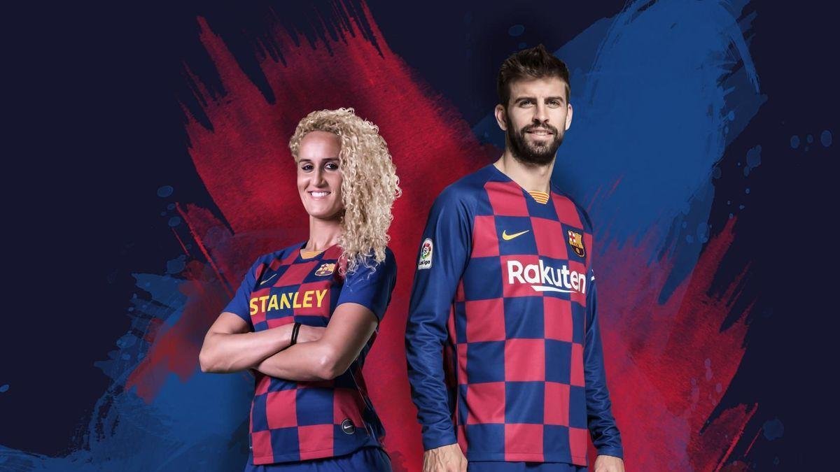
Barcelona will wearing the ugliest kit of the club’s history. Chequered ? Who came up with this brilliant idea ?? Does not look novel, does not look chique, does not look pretty. The one word that springs to mind UGLY.
Take a look and judge for yourself.

And what have we got in the photo above ? Men’s kit as well as women’s kit. Why mix the two up anyway ? Taking a progressive stance are you Nike of Oregon. . .
Why not include field hockey players, handball , basketball , and a youth academy team as well.
The printing is supplied by Avery Dennison. The sleeve badges by Sipesa.
And anyone out with the hope that the away and third kits will make up for the home kit disaster. Well , not much relief there. Not quite as bad but not very pretty either.

