Borussia Dortmund 2012-2013 Away Short Sleeve Shirt Review
By Julian Smith, Lisboa, Portugal.
Since the early 2000’s, German football has been dominated by Bayern Munich. Over the 10 seasons from 2000-01 to 2009-10, Bayern Munich managed to accumulate 6 league titles, with four different teams winning titles in between (including Márcio Amoroso and Tomáš Rosický’s Dortmund in 2001-02). Although it took Dortmund 9 years they finally won the 2010-11 season by seven points, and in some style, announcing their name to the world as a real competitor to Bayern Munich in German football. Not to be outdone, the next year Dortmund claimed the league title by a margin of eight points and demolished Bayern in the DFB-Pokal final (German domestic cup) 5-2. To add insult to injury, during the summer of 2012, German starlet Marco Reus snubbed Bayern to join Dortmund and has added some real quality to the squad. It is only fitting that their renewed excellence be accompanied by an equally classy shirt.

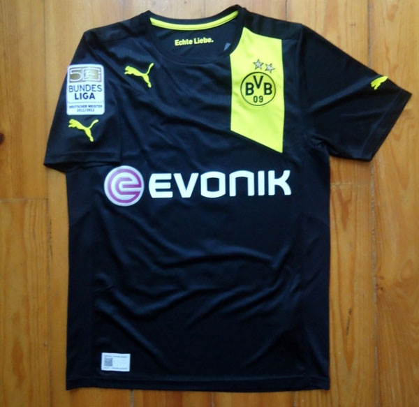
Borussia Dortmund’s 2012-13 away shirt includes the club’s black and yellow crest colors in a very stylish manner. The shirt uses black as its base, but the yellow flows in from the shoulder in a very elegant half banner. I’m very fond of the banner design, and am glad to see it being used on more kits (and not just by Puma: see Sweden 2012 away, made by Umbro, and Holland 2012 away, made by Nike).
You can always identify a Puma shirt by the company’s logo attached to the chest, as well as both sleeves. On this shirt they are in yellow, which further accents the design and gives it a nice look, although three logos is a bit much.

*Note: Shirt being worn is a medium, wearer is 6’1” and 160 pounds (1.85m, 72.5 kg)
The collar is a crew neck, although it sits a little lower than a normal t-shirt. The shirt itself fits great: it is a little tighter and smaller than the average medium football shirt, which I like and think looks quite nice when worn.
The material is 100% polyester, but that is about where recognition of what it should feel like stops. The makeup and fabric of the shirt is very sheer making the shirt very light, almost weightless. This makes it great to wear on a hot summer day, but also gives a sense that it could wear away rather quickly and easily.


The pictures above show the same area of the shirt but in three different settings. The first you will see the outside as normal, the middle shows you the shirt inverted, and the last shows it held up to the light. I’ve included this to show just how sheer the material is, but also to highlight the different makeup of different areas of the shirt. The different material is not too noticeable to the eye or felt when worn, but the sides of the shirt have a more ventilated section.
Details
Dortmund has stuck with EVONIK as their shirt sponsor for this season. The material of the sponsor logo is plastic, nothing fancy.
The shirt doesn’t seem to have many details at first glance, but the small accentuations and other details make nice additions, including a slightly hidden one!

The club badge on this shirt should be an example to all others. The crest is embroidered into the shirt, which gives it a solid, appealing look and feel from a material point of view. From a designers look, it is just as beautiful, with crisp details and fantastic color combination with the yellow accent area where it lies.

The Bundesliga enters its 50th year of incorporation in its current format, celebrating that milestone through the league patch worn on the right arm. As Dortmund won last year’s league, they hold the unique privilege of wearing the Bundesliga champions (Deutscher Meister) patch during the 50th year, which looks superb, especially in conjunction with the shirt’s colors. You can see the difference between their patch and the normal 2012-13 patch (left) and their champions patch worn last season (right).

A fun hidden detail is the clubs acronym, BVB, lining the fabric on the top of the shirt near the neck. It is almost impossible to see from afar, but a cool feature nonetheless.
Printing

The German league, like the Italian and Spanish leagues (but unlike the English and French leagues), does not have a uniform print to be used by all clubs, so they are free to choose their own print style.

Unfortunately, Dortmund opted for the generic Puma printing of which I am not a fan. While the color is nice, the block style of the font looks almost like a caveman took a crayon and wrote the details on the back of the shirt. Again, my opinion doesn’t apply just to this shirt, but to all Puma prints.

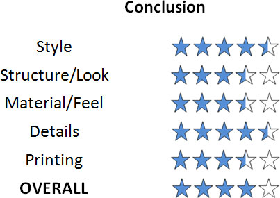
A solid shirt all around. Overall minimalist design with stylish trimmings makes it a solid purchase. Printing takes away from just a tad, but is well worth it to immortalize your hero!
As always, the official kit and printing are available to purchase from MMSports.
