By Julian Smith, NYC / Portugal
As one of the oldest and most storied football franchises in the world, Manchester United can always expect to be in the news. Since the 2013 departure of Sir Alex Ferguson, arguably the greatest football manager of all time, headlines around United have largely been negative. United fans became accustomed to unprecedented levels of success under the “Fergie” years, and the team has struggled to live up to those standards of yesteryear, leading to outcries from anyone and everyone about the current squad.
When United debuted their new away shirt for the 2017-18 season, the style evoked a sentiment much needed of the squad: modernization of historical glory. This kit design, as will be detailed more later in this review, is inspired by the away shirt used by United in 1990-1992. The shirt debut was coupled with some truly magical performances at the beginning of the year which unfortunately for any fan of football have waned as the season has gone on. The shirt is no less beautiful though, and while the comfort may not be up to the standard of the style, it sure is nice to look at.
The Shirt
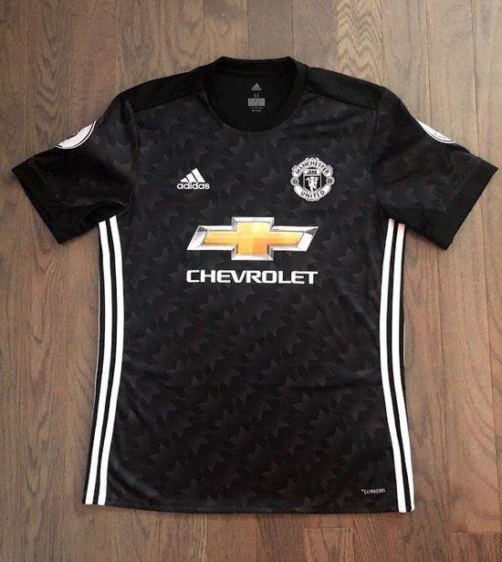
Manchester United’s 2017-18 away shirt is textured with a leaf-like design in monochrome fades. This is one of the most complex shirt bases of a top tier club in recent memory, straying far, far away from an in vogue minimalism we see with many household name shirts. Manufactured by Adidas, the shirt implements their patented climacool material.
Recently, the major brands have begun to sell both replica and authentic versions of shirts, the latter of which is supposed to more closely resemble what the players wear. The replica shirts now tend to feel more like a normal t-shirt, with materials being a bit heavier and feeling comfortable on the body.
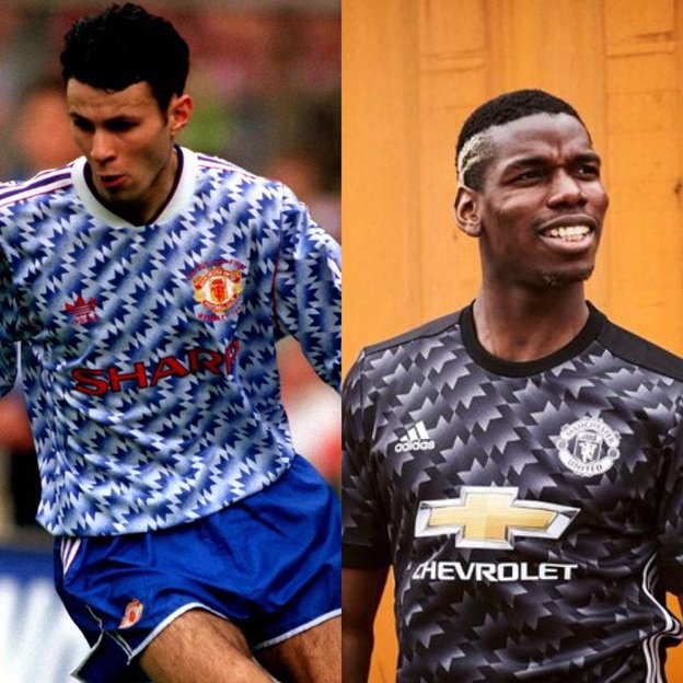
As mentioned in the introduction, this design harkens back to the early 1990’s when Brian Robson, Mark Hughes, and an up and coming Ryan Giggs were representing the Red Devils.

The back panel of the shirt does not contain the textured design, and is in solid black.

The shirt follows the recent trend of contouring the sides as it goes down the body, creating a snug but not body tight fit, which gives a slimming look as well. The Adidas stripes in white running down the sides, contrasting with the black and white glow of the shirt, make for a very nice effect.
Adidas opted for the crew neck collar on this shirt in solid black, probably to add a bit of style stability. I couldn’t imagine if this shirt had a protruding collar or some sort of hybrid… best not to risk by overdesigning.
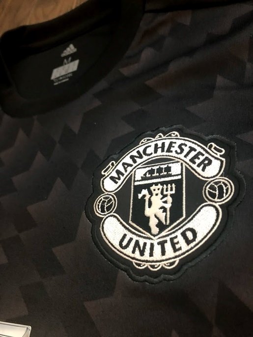
The club badge and Adidas logo are both in white with black accents on the former, keeping the very sleek monochrome coloration. Both are stitched into the shirt, and the color continuity adds a lot of style.

It’s a shame the Chevrolet logo is such a blaring intruder on a sleek backdrop. Even still, the yellow of the emblem isn’t too over the top. The sponsor logo is printed on, and feels like a plastic material kind of like the name and number printing.

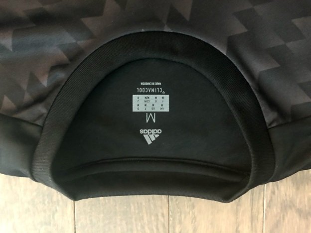
Adidas again opted for what I maintain is a very weird decision in creating this weird panel structure on the inside of the shirt. Not that it deserves much attention, but I find it totally strange and figure it’s worth sharing simply because of how weird it is!
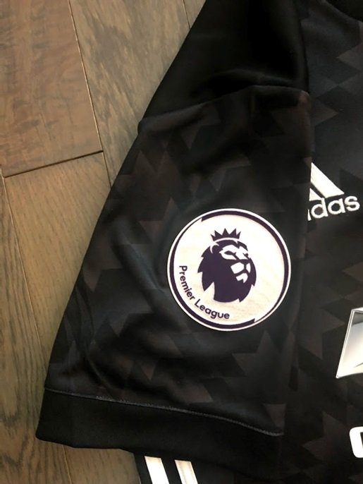
A quick note of appreciation for the Premier League badges, which I absolutely love. Again, fitting with the modernization of the shirt, the badges display the new league logo in a circular patch. It’s a bit bulky, and two badges are really unnecessary (the Premier League is the only major league that uses a badge on each arm), but I like the overall design so much I don’t mind the minor negatives.
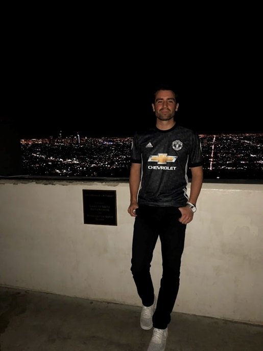
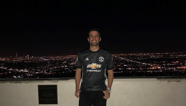
LA at night in the background (red)
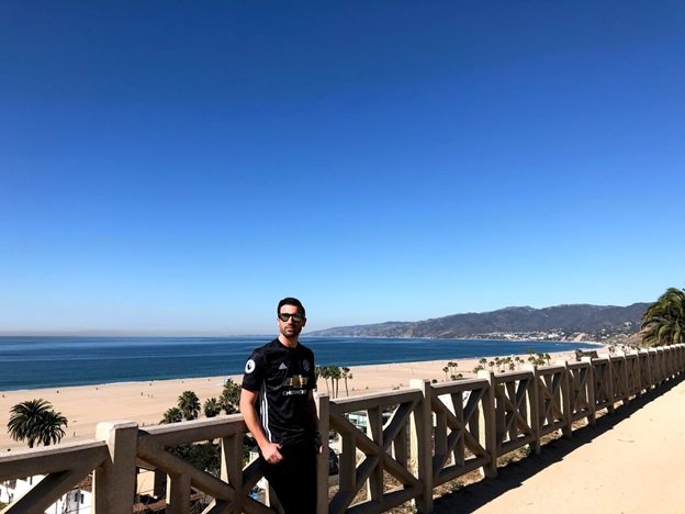
Putting it all together, you get a pretty clean looking shirt in the black of night or the light of day!
The Print
New Style of Printing 17/18.
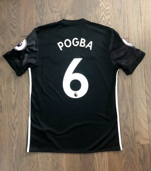
The design of the new Premier League printing, which was introduced this year, is simply fantastic. I love the look of the letters and numbers, and the PS-PRO material used is light but feels durable. It’s a far cry from the Lextra felt material used in years past, which this author misses dearly, but is an upgrade from the totally boring style used between 2013-2017.
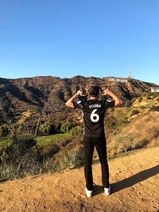
And of course, with one of the most bold shirt designs, only one player is fit to adorn this shirt and have this photo taken! All hail Hollywood Pogba!

A rare 5 star review from me! But as I was tallying the points I thought would be fair, it became clear that this is really an exquisite shirt in many facets! The few negatives and overwhelmingly overpowered by the many positives, in my humble opinion.
As always, the official kit and printing are available to purchase from MM Sports at idfootballdesk.com
