By Julian Smith, NYC
Portugal away jersey 2015/16 | back in black
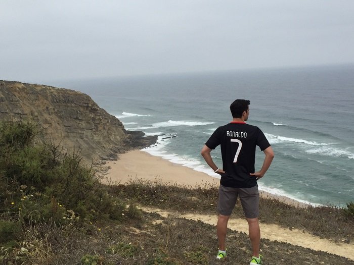
Portugal: a country of 10 million people and some of the most recognized football icons on the planet. Super agent Jorge Mendes, super manager José Mourinho, and super hero Cristiano Ronaldo all hail from the Western-most European nation that has experienced staggered footballing success. A Seleção das Quinas first appeared on the football map with the emergence of Eusébio, who led Portugal to a third place finish at the 1966 World Cup. Some years of anonymity ensued, followed by a golden generation: which included the likes of Luís Figo, Rui Costa, Pauleta, and Vítor Baía. While those stars underwhelmed in their prime, eventually Portugal finished in 2nd place at Euro 2004, and in 4th place at the 2006 World Cup. That era ended as the era of Cristiano Ronaldo began, but his international teammates have relied too much on his superior abilities and have not been able to seriously challenge for a trophy of late. There is promise for the future, though, as a number of youngsters have shown serious ability, dominating many at the 2015 U-21 European Championship before suffering a shock loss to the Swedish. Hopefully, the elusive first trophy will enter the empty cabinet after Euro 2016 and get Portugal on a winning track.
In the meantime, they can hope that Nike continues to ensure they at least look good on the pitch. The 2015 away jersey is stunning in appearance, but leaves much to be desired when worn.
The Shirt
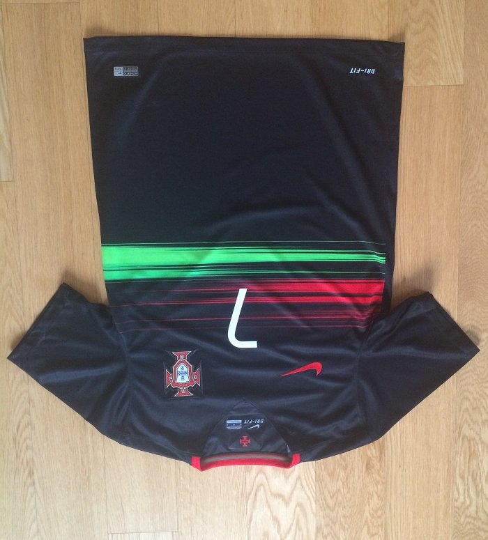
Nike used a v-neck with a bottom lip, which I rather like on this shirt given that it all blends together. The v-neck is also used on the 2015 USA home shirts, but the contrasting colors make it look much more awkward. The red accent around the opening with infused green piping adds a nice bit of flair.
Details

In this close up, you can see the poor material quality. Honestly, just by looking at it I think you can see how uncomfortable it is… on a happier note, the badge is nicely sewn into the shirt with black stitching.

The Nike logo is in red, which works well with everything else. Green would’ve looked out of place and white would be too much contrast.

The sides of the shirt have a porous strip to allow for extra ventilation. It is much more breathable than the main pieces of fabric and I could absolutely see how it would help cool you down on a hot day.
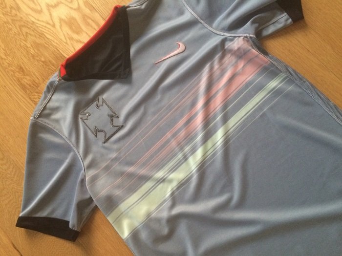
Inverting the shirt shows the discolored interior. I still don’t know why this is, but it cannot be good. I have a feeling this is a product of the deteriorating material quality used more recently in mainstream replica shirts.
Printing
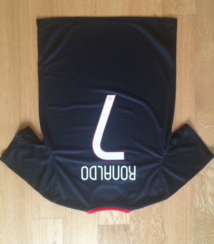
I’m torn on this print. The font is actually pretty good, but the back and front numbers are quite different in that the back is much more intricate in design. The front is a single, white piece of plastic (see close-up above).
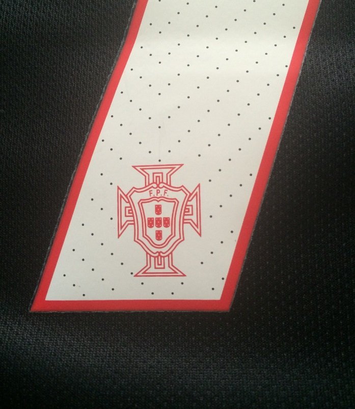
As seen here, the back number has a dotted design with a red border and crest.
Beautiful!

It pains me to write this not so favorable review, but ultimately these shirts are meant to be worn, and if they’re not comfortable that’s a huge problem. It may look great on the stars on the pitch or in your closet, but don’t plan on wearing this one much.
As always, the official Portugal away jersey and the official printing from Sporting ID are available to purchase from iDfootballdesk.
Click here to check out the Portugal national team jerseys
